Update available dialog is poorly designed and broken
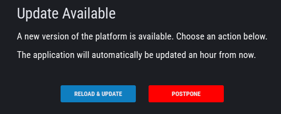
This dialog make it impossible to access trade controls. Furthermore clicking postpone does not even work.
A notification like this should instead be some kind of icon, link, banner on the edge of the application that is clickable. It shouldn’t be a popup dialog, and it certainly shouldn’t block trade controls
Log in to comment and vote
Comments1
sitajag
Jul 27, 2024
It took me off guard when it popped up and covered my practice screen around 2:30 at a high peak mnq wave roll!
The Update menu be on the left panel with a Red or different Font color, then when hoovered over it, it should show a few sentences about the update. After the user clicks on the link, it updates the browser and the Font color becomes a normal color. This will tell me that the update was successful.